The essentials of split toning photos
Posted on Apr 17, 2020 • 5 minute read
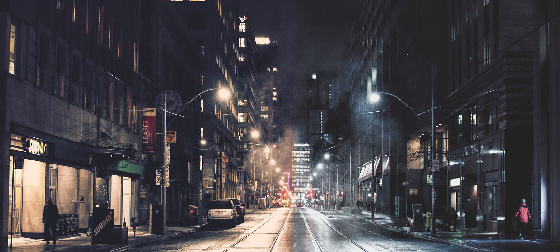
Split toning is a real essential of photo editing, yet it’s overlooked by many. Here’s how it can drastically improve your images.
In the first instalment of our ongoing editing series, we covered the basic adjustments you need to know about, including exposure, colour balance, saturation and more. While those are certainly the essentials, when it comes to refining the look of your image in a more creative sense, few tools are better than split toning.
In the most basic terms, split toning allows you to add specific colours to and subtly adjust the tones of the highlights and shadows in your photo, independently of one another. As subtle as these changes are, they can improve your photos drastically.
Manipulating the colours of your image using split toning can dictate not only the look, but the feel of your photo. As such, it can be a great tool when creating a photo series – which is something we’d recommend every photographer tries at least once. It’s also a simple and effective way of refining your personal ‘look’, so going beyond just a series, all of your photos are distinguishable and unique.
Naturally, as with any aspect of photo editing, some photos lend themselves to split toning more than others, but it’s a technique that can be used at least to some degree on anything from portraits, to street scenes, to landscapes. You’ll find some colours work better together, and look nicer within certain photos’ broader colour palettes, too. Many opt for popular opposing colour combinations such as orange and teal, or green and magenta, but you can also experiment and find what works well for you.
Click the images to see a larger view
How to edit using split toning
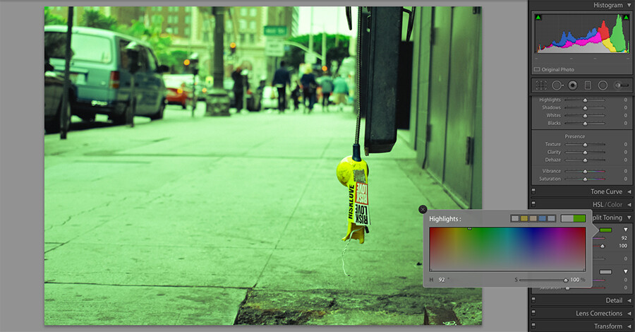
Perhaps the easiest way to split tone is in Lightroom, using the dedicated Split Toning panel. Here, Highlights and Shadows are shown in separate tabs and colours can be selected using the Hue sliders or by clicking the rectangles within the panel and using the larger gradient box.
When selecting a colour, try increasing Saturation to 100% to give you a clearer idea, then reducing it to an appropriate level afterwards. As with any type of photo editing, subtlety is often best.

The final feature within Lightroom’s Split Toning panel is Balance. This slider dictates whether the highlights or shadows are favoured more, and at the extremes, allows you to add colour to only the brightest highlights or darkest shadows. If you want to copy these settings to other photos to give them running consistency, simple click Edit, Copy, select the settings you wish to copy, and paste them on to your next photo.
There are, of course, a number of other ways to achieve similar results. Your preferred editing software may have a dedicated split toning tool just like Lightroom, but if not, here are a few things you could try.
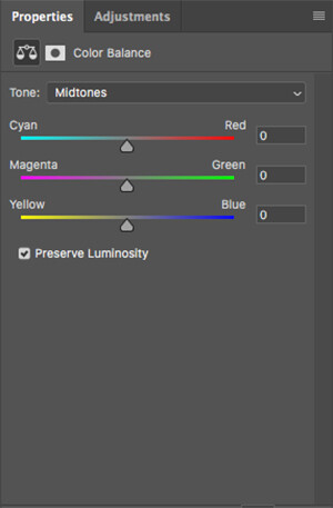
In Photoshop and other similar software, you may be able to adjust the colour balance of your highlights, midtones and shadows individually, though in a slightly more limited way than a dedicated Split Toning panel. To do this, add a Color Balance adjustment layer, and in the Tone: dropdown menu, select Highlights or Shadows before making the adjustments using the sliders below.

A third option can be done using any editing software that offers a Layers feature. One of our previous editing guides covered layers and masks, so it may be worth reading if you’re completely unfamiliar – this is nothing complex, though.
With this method, simply add a solid colour fill layer over the top of your photo, set the blend mode to Exclusion and reduce the opacity. The limitation here is that Exclusion automatically selects the opposite colour to the one you’ve selected, which isn’t necessarily a bad thing, but does remove the complete creative freedom of a dedicated tool.
Practically speaking, split toning really is as simple as that. The difficulty lies in really refining your colours, and that comes only through experience, so give it a try!
If you’d like to share your before and after pictures, you can find us on Instagram, Twitter and Facebook at the handle @photonewspn
Don’t forget to sign up to receive our newsletter below, and get notified about the new issue, exclusive offers and competitions.
Have you heard The Photography News Podcast? Tune in for news, techniques, advice and much more! Click here to listen for free.


