The five essentials of basic photo editing
Posted on Mar 25, 2020 • 10 minute read
Taking good photos is only half the battle – almost always, a bit of editing is required to make them really great. Here are the bare essentials.
If you ask any photographer, we’d wager the majority would tell you that editing your photos is an absolute essential. Even if the edits are very minor, they go a long way in shaping the look of the final image.
Now, things can become very complex, but basic photo editing is actually very simple. All it takes is some understanding of the tools on offer and a bit of practice. The editing tools we’re going to cover here can be found in almost any editing software, and even your smartphone, so you can apply this knowledge however you choose to edit.
It’s worth noting that, like any aspect of photography, editing is subjective. What looks good to you may not be to everyone else’s taste and vice versa, and as you become more experienced, your ability to perceive the elements of a photo will likely change.
Before you start, here are a few things to consider. Shooting photos in Raw gives you more latitude when it comes to editing, and it’s a good idea not to save over your original images. Once certain edits are burned in, there’s no going back, and if you change your mind later on, you won’t have much to work with.
Now, let’s get into the five essentials.
Crop
You may think cropping barely constitutes as photo editing, but it certainly shouldn’t be overlooked. It’s unlikely you’re going to change the entire look of your photo by cropping, unless the crop is significant, but editing is all about subtle changes. That’s well worth keeping in mind throughout.
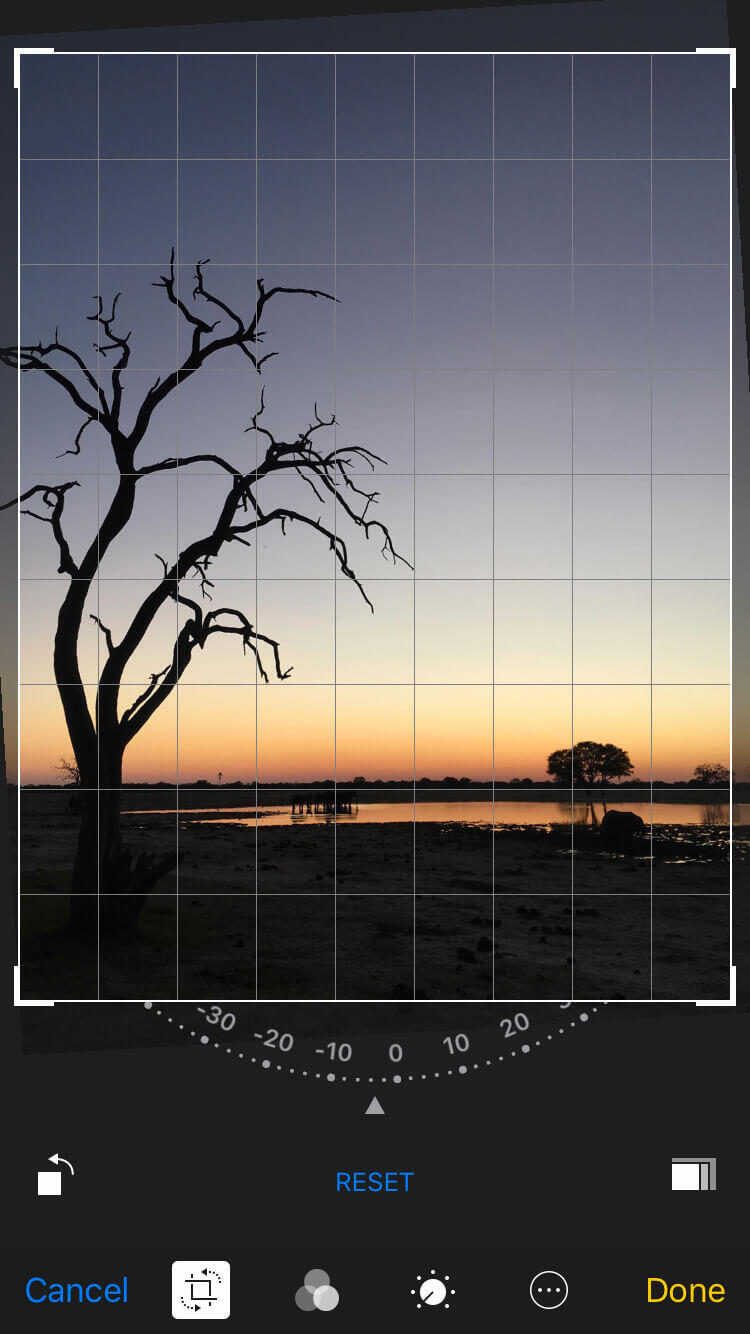
One thing you may wish to do is straighten your horizon, or any other lines in your shot for that matter. Lots of editing software has an automatic straighten function with Crop, but it’s also very likely that you’ll be able to view a grid overlay and adjust the image yourself.
Once your image is framed as you’d like it to be, you’re ready to move on to the next step.
Exposure and brightness
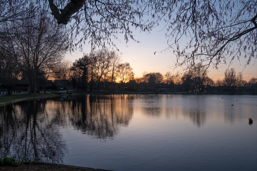
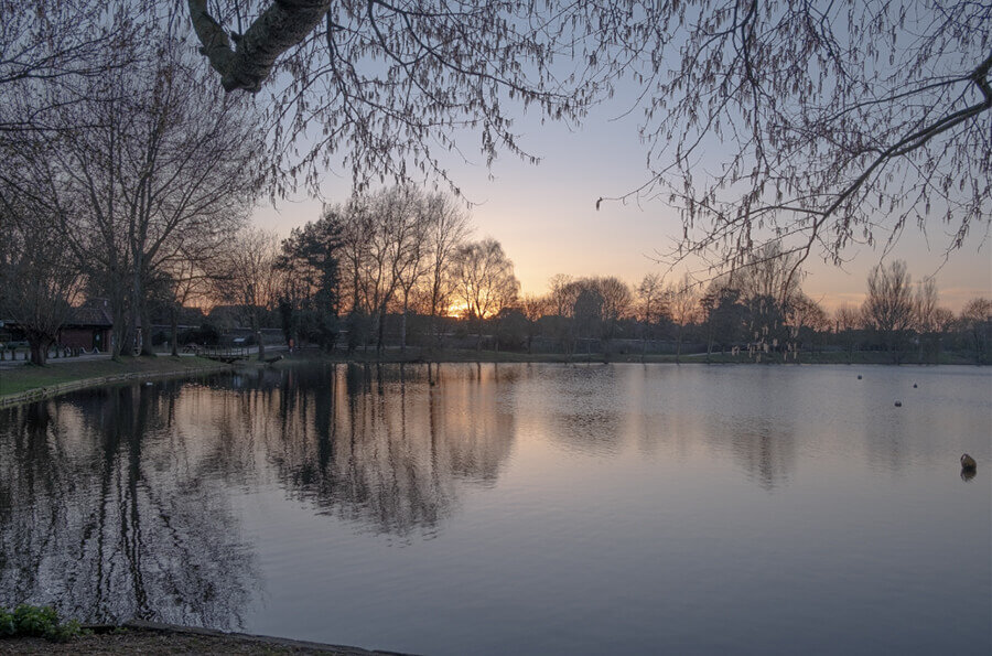
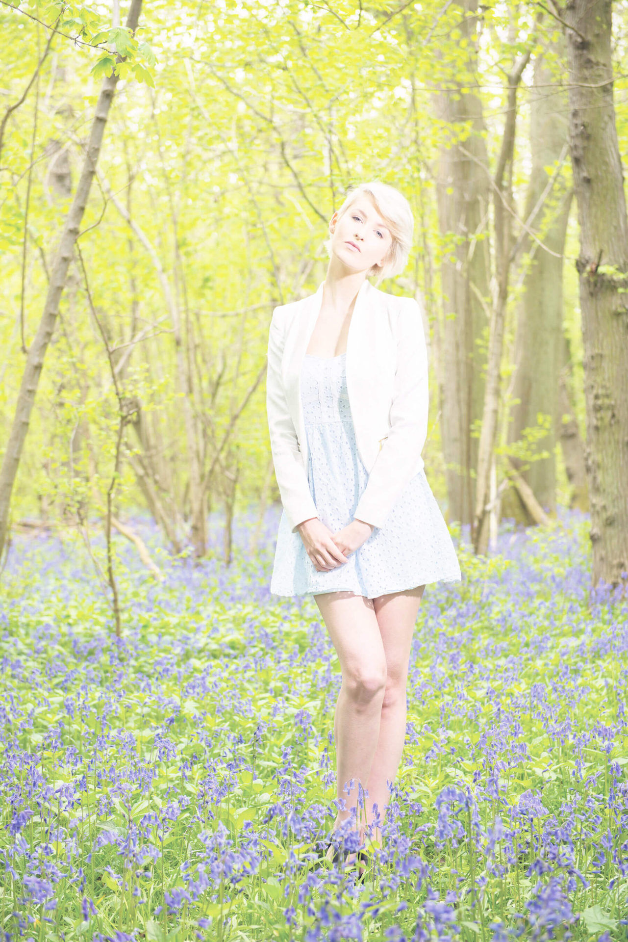
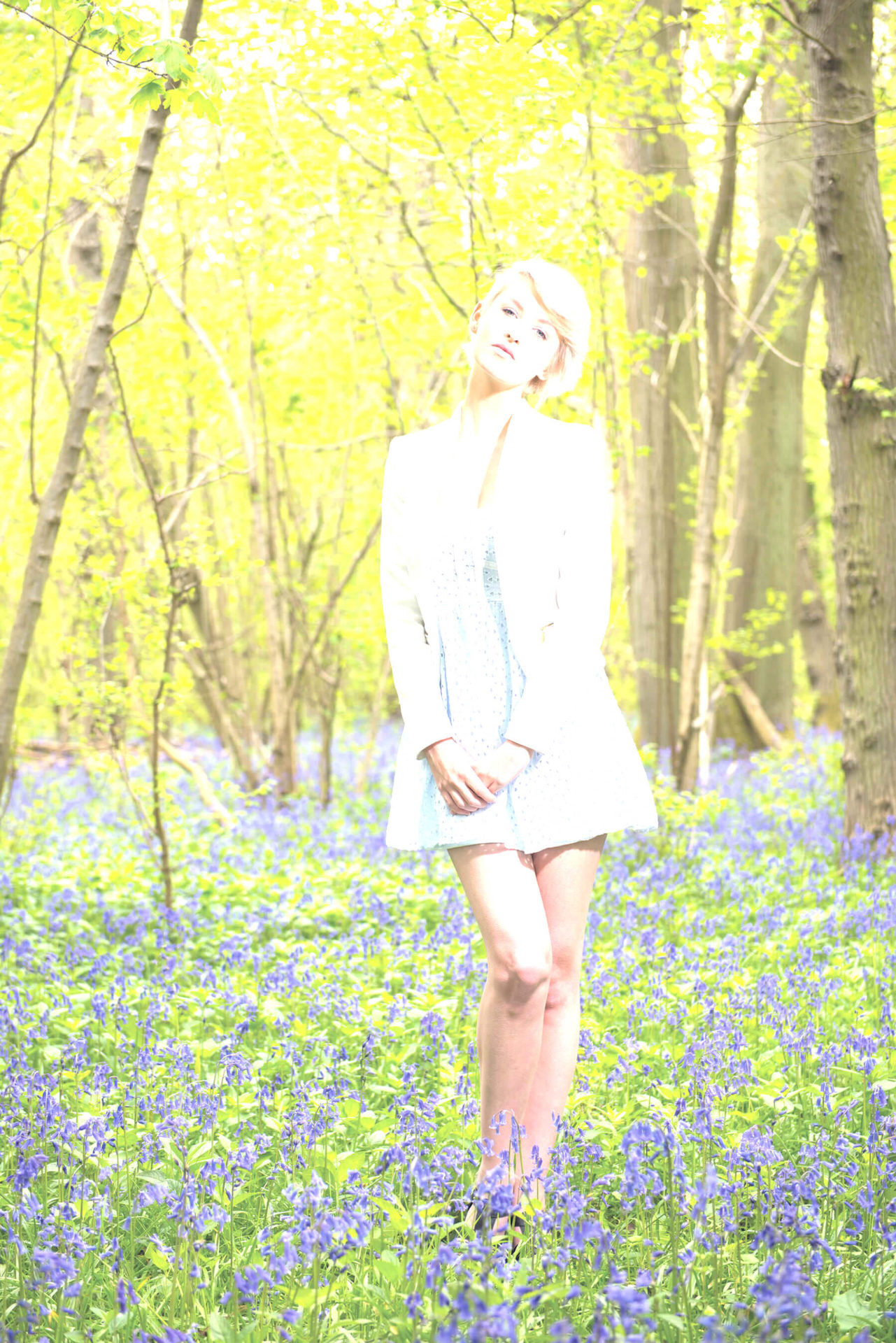
Before you get into the elements that control the finer points of your image’s look, you need to make sure your image isn’t too dark or too bright, so the next basic photo editing step is exposure.
There’s no better way to do this than ensuring your exposure is as accurate as possible when actually shooting. Still, some photos can be recovered quite well, depending on the camera, especially if you’re shooting Raw – as much as 3-stops in some instances.
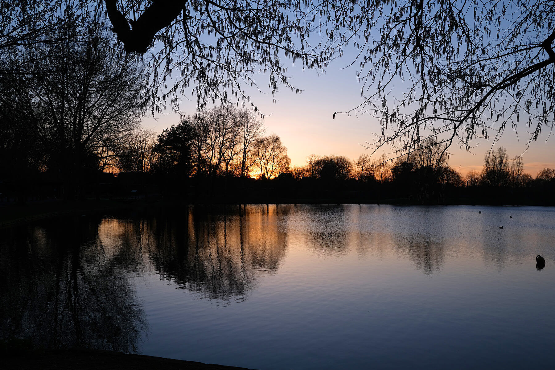
Click the images to see a larger view
When editing your exposure, your histogram is an extremely helpful tool, though it’s not offered in some editing software. Even with the histogram, you should trust your eyes to a certain extent. Try to avoid excessive clipping of the shadows or highlights where possible, but in high contrast scenes, you’ll likely have to lose some level of detail in one or the other. In these instances, it’s down to you to decide what your intention is – and really, it’s best to have this in mind while shooting, too.
There’s another similar option for adjusting the brightness of your image, and unsurprisingly, it’s Brightness. It does differ slightly to Exposure and it may be a better option for you, depending on what you’re looking for.
The Brightness setting lifts or lowers all areas of your photo evenly, whereas Exposure biases the highlights of the image just like overexposing in-camera would. So, if the balance of your photo is good and you don’t wish to blow out the highlights, give Brightness a try.
There is another way to affect the relationship between the darks and lights, but we’ll get onto that shortly.
Click the images to see a larger view
White balance and tint
The next step in the basic photo editing process is adjusting white balance. This may be called Colour Balance, Warmth or something else, depending on your software. We’ve written about shooting with custom white balance before, but in short, every light has a colour temperature. The effect this has on your photo is making it look more yellow or blue – particularly in any white areas.
Though subtle, this plays a significant part in the look and feel of your photo, so it’s important to get right. Maybe you want very true whites, or maybe you want a warmer or cooler look. In any case, it’s usually controlled by a simple slider, or in some instances, can be done automatically.
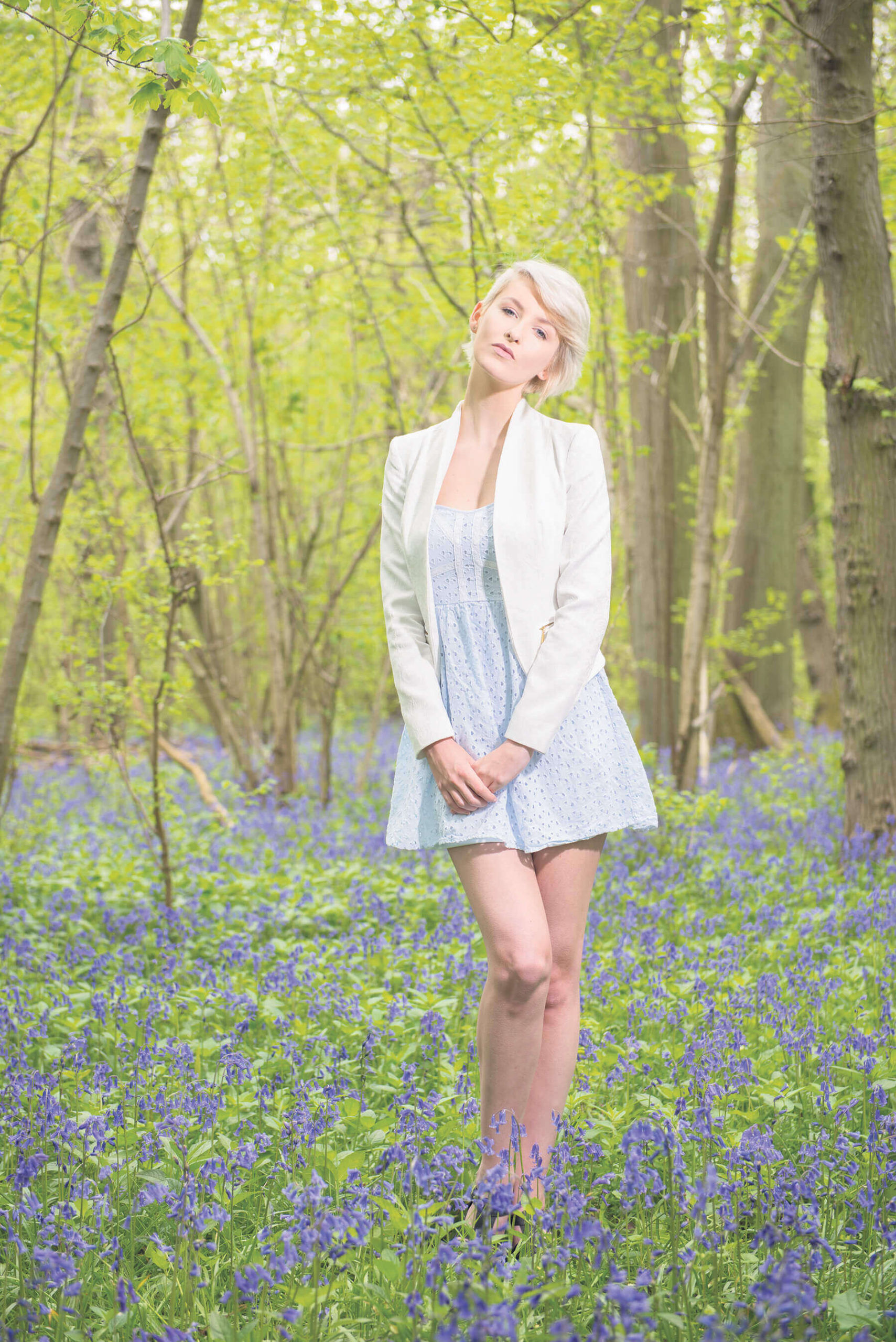
Tint usually has to be edited less than white balance, but is still fairly common, particularly when editing skin tones. Here, magenta and green are the two ends of the spectrum and a neutral balance is almost always best.
Click the images to see a larger view
Saturation
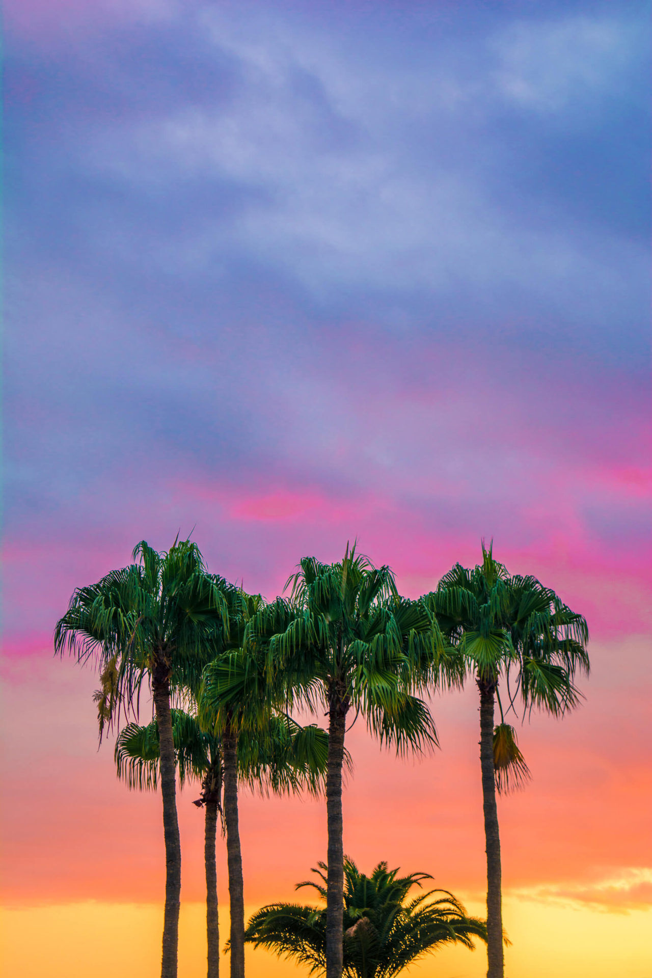
Saturation plays, perhaps, the biggest part in the look of your photos. You can go from a washed-out, almost colourless scene to one that’s brightly coloured and cartoonish, and what to opt for varies from person to person, subject to subject and even photo to photo.
To simplify, saturation refers to how much colour is present, rather than the specific colour, which is hue, or the brightness of the colour, which is luminance. There’s little more to choosing saturation other than how much you want the colours in your photo to ‘pop’. Once again, though, subtlety is often best.
Saturation can actually be of great help when editing white balance and tint. If you take the Saturation toward its upper extreme momentarily, it can help reveal the otherwise hard-to-see yellow or blue tones.
Click the images to see a larger view
Contrast and levels
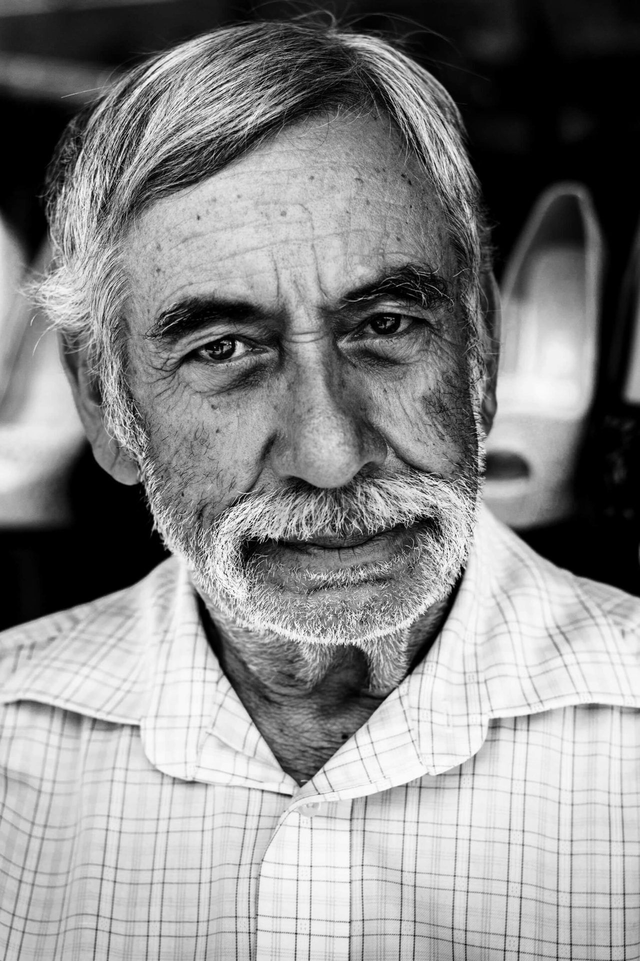
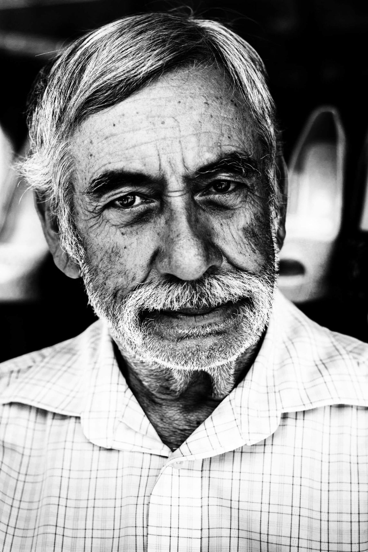
Contrast is the final step in this basic photo editing guide. Remember earlier when we said there’s another way to affect the relationship between darks and lights? That’s contrast. As the name suggests, it’s how much the darkest and lightest areas of your photo differ. This means you’ll be able to have a photo with an extreme difference between the two, or one that’s a bit flatter – the latter can be used for maintaining detail across the whole photo.
If you look at your histogram once again, you’ll see that reducing the contrast takes information from the extreme darks and lights and moves it towards the midtones, and raising the contrast spreads the information, pulling it towards either end.
You can use Levels to a similar effect, but with the benefit of greater control. You can choose how dark the darkest shadows are, and how bright the brightest highlights, independently of one another. You can also adjust the midtone point, stretching the shadows or highlights in the process, though this is slightly more advanced.
Much like returning to white balance following Saturation adjustments, you may want to go back and tweak your Exposure or Brightness settings after you’ve set your Contrast or Levels. Editing is all about nuance.
Click the images to see a larger view
So, there you have it, the basic photo editing tips you needed to get started, so it’s time to give it a go! The best way to learn is by doing, and with all these settings, opening up a photo or two and giving them a try is your best course of action.
When editing, as with anything in photography, try to be intentional. What do you want the photo to look like, and how can you get it there? Of course, experimentation is fine, and actually very beneficial, so don’t get too hung up on perfection.
Do you want to share your edits or editing tips? Get in touch on social media using the handle @photonewspn!
Don’t forget to sign up to receive our newsletter below, and get notified about the new issue, exclusive offers and competitions.
Have you heard The Photography News Podcast? Tune in for news, techniques, advice and much more! Click here to listen for free.

